Welcome to the Next Evolution of Asset-Map
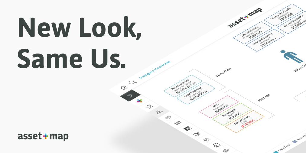
We’re thrilled to announce the launch of a brand new look for our platform. This redesign is the result of years of internal discussion and feedback from our best-in-class subscribers. You can think of these changes as a minor retooling of some core aspects of the user experience as well as a fresh set of clothes for a product that has grown considerably since version 2.0 over 5 years ago.
The Most Important Data, Now Cleaner than Ever
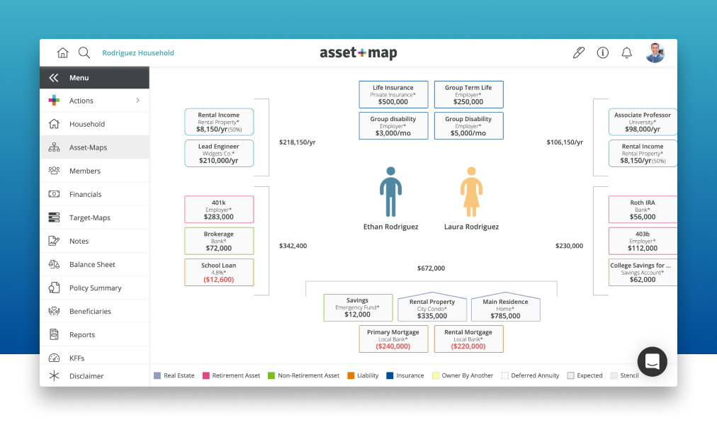
Among the more noticeable changes is the removal of the shazam bar which previously ran across the top of each household, and has been replaced by a standardized left-hand navigation menu. We took the opportunity here to expose previously hidden pages (Balance Sheet, Beneficiaries, etc.) and display them among those which are more heavily visited (Asset-Maps, Target-Maps, Financials, and more).
Within each household, you can now switch between the pages faster than ever thanks to our optimized backend architecture. Through this process, we’ve seen speeds improved by more than 50%, allowing you access to your data in an instant.


Household Creation in a Snap
We've kept the three traditional means of bringing data into the platform (Manual, Discovery, and Integrations) but have streamlined the process so that you spend less time building households and more time advising your clients.
The manual household wizard as you know it has been flipped on its head. We took this opportunity to bring our most important value proposition, visual simplicity, into this step by building a more user-friendly process that gives a visual overview of all existing members.
Small additions, like the ability to tab through fields and backend processing improvements, speed up new household creation overall.

Continuous Tracking of Financial Progress and Priorities.
Target-Maps have also experienced a speed upgrade in addition to other more subtle changes. We’ve removed some of the display text and restyled the progress bars for a cleaner and more accessible appearance. Functionally, buttons and key data have been shifted into more sensible locations for ease of use.

Organization and Clarity at the Forefront
After receiving feedback that the previous iteration of the report center for a household felt a bit clunky, we went back to the drawing board and designed a brand new view.
The interactive table of contents provides easier recall of the various reports generated for a specific household as well as some smaller but commonly requested features including an estimated page count.
On the horizon, we will be adding the ability to create default report layouts and reorganize this table of contents so you’re only seeing the information that you want.

Widgets and Miscellaneous Updates
Throughout the new UX, you will notice that many of your favorite features have been visually or functionally tweaked to improve the overall look and feel. From the feedback we’ve compiled, new additions, such as the ability to customize the pen color, have been added.